Learn
Market Conditions Going Forward — A Technical Analysis P.O.V.
By Chris Brown, CIMA®, CRPC™ Vice President — Investments
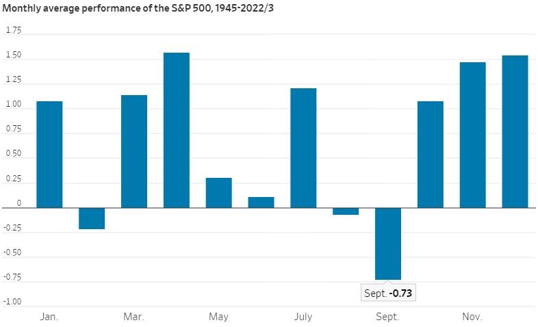
Out of all the seasons, fall has to be one of my most favorite times of the year, especially in Georgia. College and pro football have returned, the outdoor foliage expresses the most beautiful earthtones, and there’s enjoyment in a bit of pumpkin spiced everything. Although it may represent the perfect seasonal time in Georgia, it is also the weakest season for the equity markets. The monthly average S&P return in September — since 1945 — is a negative 0.73%, the lowest monthly average return of all months. This is known as the “September Effect.”
Source: The Wall Street Journal
The recent pullbacks in the markets have mostly been driven by the rise in the U.S. dollar, “higher for longer” talk by the U.S. Federal Reserve (Fed) and a slight uptick in inflation due to the recent jump in oil and natural gas futures.
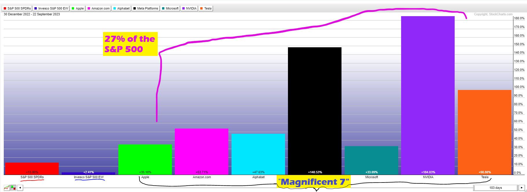
One of the biggest market success stories for 2023 stands as the “Magnificent 7.” As a recap, the “Magnificent 7” companies as part of the S&P 500 are Apple, Amazon, Google, Meta (Facebook), Microsoft, Nvidia and Tesla, comprising more than 27% of the of the S&P 500’s market value.1 Since the S&P 500 lists companies from largest to smallest in market capitalization size, this means that the largest companies have a more substantial impact on the index performance. See below for the 2023 year-to-date (YTD) returns histogram for SPY (SPDR S&P 500 ETF), RSP (Invesco S&P 500 Equal Weight) and the “Magnificent 7” stocks. This compares to what the S&P returns would look like this year using the RSP exchange-traded fund — if all the stocks of the S&P 500 were equally weighted versus the traditional cap weighting of the S&P 500. As of September 22, the S&P 500 was up 13.80%, the equal weight S&P 500 (RSP) was up but only 2.41%, while the “Magnificent 7” stocks have returned as low as 33% with Microsoft and as high as 184% with Nvidia. Though the RSP ETF created more downside protection in 2022 being down 12.95% compared to the S&P 500 being down almost 19%, the narrative shifted from high-quality value stocks back to growth, catching most of institutional money managers off guard.
Source: StockCharts
A Technical Look for the Near Term
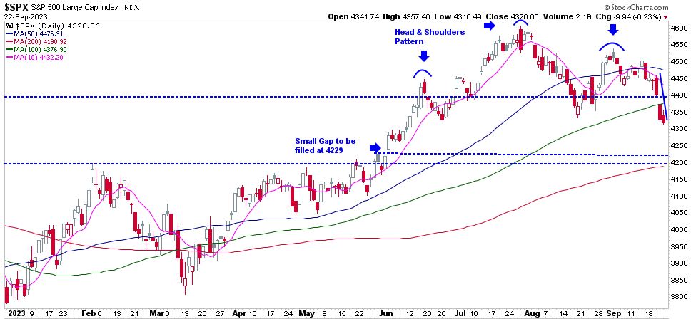
Since the end of July, the S&P 500 has declined by 5.8% through September 22 (4,588 points on July 31 to 4,320 as of September 22). Where do market analysts believe the markets will go from here? Based on technical indicators, the S&P 500 daily chart (each candlestick bar represents one trading day) recently confirmed a head-and-shoulders pattern in its most recent price descent over the past three trading days.
The technical term of a head-and-shoulders pattern indicates a bullish to bearish trend reversal within the short-term context. The pattern appears as a baseline with three peaks, where the outside two price spikes are close in height (the shoulders), and the middle price is the highest (the head).2 Most descending trend reversals continue to fall to the previous support, or last high prior to the first shoulder being established. The last high prior to the first shoulder was on June 2, when the S&P closed up at 4,282. There may be a good chance that the price action fills the price gap that was established between the end of the June closing to the beginning of June 2’s trading session; this is known as “filling the gap.” Since the gap lies at the S&P price of 4,229 (indicated on the chart) and the 200-day moving average (red upward sloping line) at 4,200, the likelihood of the market settling back at this price level is highly likely before reversing and moving back up toward its previous high.
Source: StockCharts
The Long-Term Secular Trend
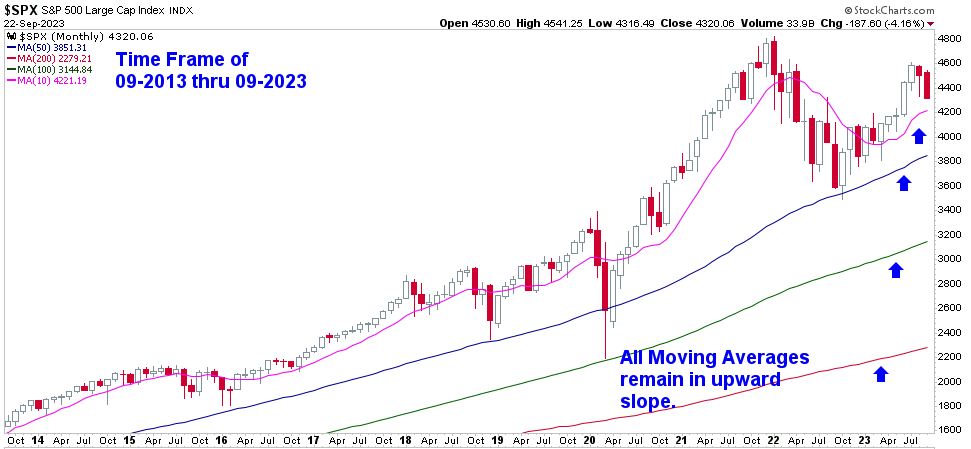
In a technical review over the long-term secular trend, discussed in my September Market Update article, we review the S&P 500 chart from a longer term monthly chart. Reviewing the market trends on a monthly chart allows us to digest its data from a wider lens to identify conditions and provide guidance for many of our long-term equity investors. This monthly chart shows the 10-year S&P 500 monthly price (each candlestick represents one month). Also included: the 10-month (pink line), 50-month (blue line), 100-month (green line) and 200-month (red line) views, moving averages in context as support to the recent price declines of the S&P 500. There are a few positive indicators that show that the long-term bull market trend is still intact.
First, the current S&P price (last red candlestick on the top right of the chart remains above the 10-month moving average.) Also, notice the 10-month moving average is showing a support trend near the 4,200 S&P price area, similar to the data I shared in the third chart above. A coincidence or technical price action? Second, all long-term monthly moving averages are in an upward sloping pattern, representing the bull trend remains. Third, the Relative Strength Index (RSI) in the fifth chart below represents a price momentum indicator, used to measure the speed and magnitude of a security’s recent price changes to overvalued or undervalued. The scale measures from 0 to 100, with 50 representing the midline of bullish (over 50) versus bearish (under 50). An RSI showing anything above 70 may represent that the security is overbought, while an RSI below 30 may show that a security is oversold.3 The RSI on the S&P monthly chart currently sits at 54.57, which demonstrates the S&P 500 remains in a bullish trend.
Source: StockCharts
Chart 5 - RSI Monthly Indicator

Source: StockCharts
Technical Secular Bear Market Trend in Comparison
Now that we have discussed the long-term secular bull trend, it is only fair to examine a long-term secular bear direction so you can detect the difference in price action and what we want to watch out for if market conditions worsen in the future.
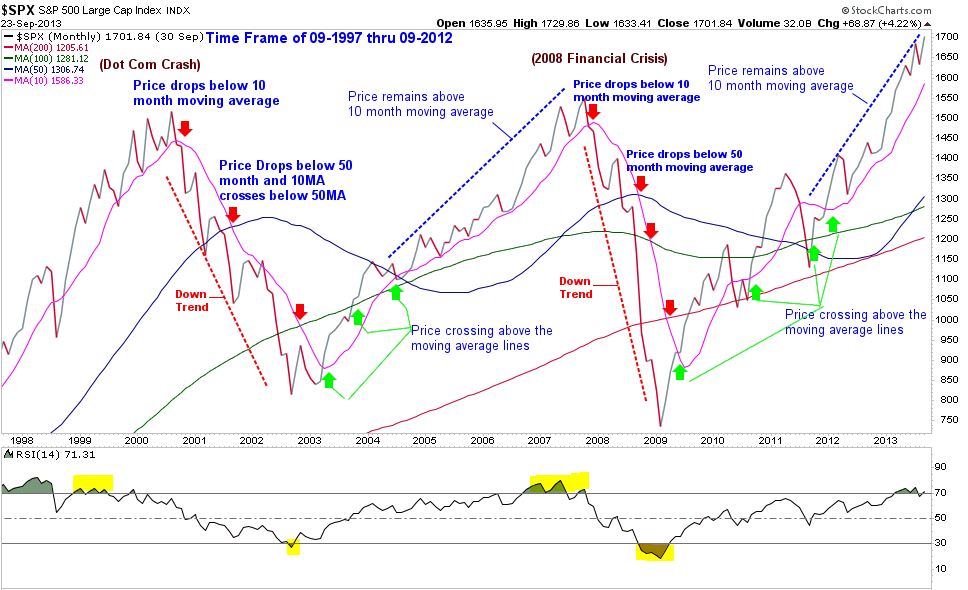
Reviewing the S&P 500 monthly chart, to keep this example consistent, all the moving average lines remain the same color (10 month=pink line; 50 month=blue line; 100 month=green line; and 200 month=red line). The time horizon showed the end of the secular bull market in the late 1990s. The S&P price dipped below the 10 month but made a move for new highs; all moving average lines were still upward sloping. The S&P price started retreating in August of 2000, and by September it broke below the 10-month moving average; the moving average (pink line) started sloping down.
June of 2001 provided the next confirmation of a bear market trend when the S&P 500 price broke below the 50-month moving average (blue line). It continued to fall through the 100-month moving average in June 2022, finally hitting bottom in September 2002. In other words, it moved down 47.5% from the peak of August 2000 to September 2002. The market then recovered for the next five years and established a new market high at 1,576, returning a positive 188% (37.5% annualized average between 2002-2007). In November 2007, the S&P price dropped below the 10-month moving average; the 10-month moving average line started sloping down. By June 2008, the S&P price dropped below the 50-month moving average (the same setup in the dot com crash) and persisted to fall another 47.5% before recovering in March 2009.
Source: StockCharts
Reviewing technical indicators of the long-term secular market conditions today versus the late ‘90s and early 2000s secular bear market chart, there is a vast difference in the current trend. As mentioned in my September Market Update article, secular bull market trends may include short-term volatility and also recessions that create tremendous fear and uncertainty for an investor’s outlook on the economy and market conditions. Although there is a large correlation, the market is not the economy. We use technical analysis as one of many disciplines to understand microeconomic and macroeconomic and market trends. Trends can shift abruptly, and utilizing our technical and fundamental resources help create an unbiased perspective on current price and momentum indicators. Remaining disciplined in your investment strategy, knowing your time horizon and understanding your risk tolerance will help you remain confident in your wealth-building strategy. Speaking with your financial professional and reviewing your financial game plan helps to create the best odds to secure your desired financial future.
Important disclosure information
-
Magnificent 7 Market Cap data- https://www.investopedia.com/top-25-stocks-in-the-s-and-p-500-september-2023-7853313
Back -
Head & Shoulders defined- https://www.investopedia.com/terms/h/head-shoulders.asp
Back -
Relative Strength Index Defined- https://www.investopedia.com/terms/r/rsi.asp
Back

